PIE Items and Elements
Understanding the foundational concepts of PIE: reusable elements that compose into complete assessment items.
Introduction
PIE Element
A PIE Element is a reusable, interactive component that implements a specific question type. Think of it as a building block.
- Multiple Choice
- Text Entry
- Graphing
- Drag and Drop
- 20+ question types
PIE Item
A PIE Item is a complete assessment question that may contain one or more elements plus optional supporting content.
- Reading passage
- One or more questions
- Scoring rubric
- Feedback and hints
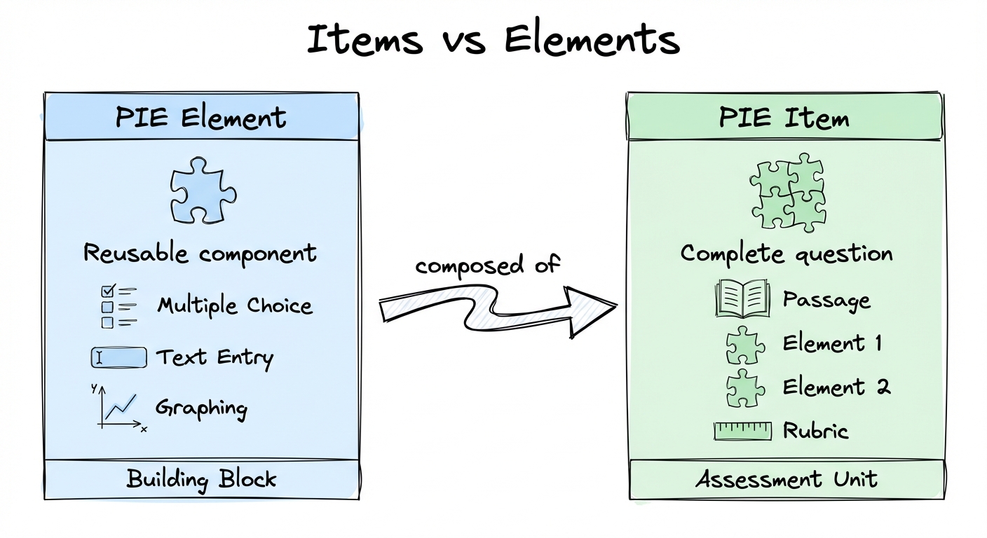
Items are what students see as complete questions. Elements are the interactive components that capture responses. An item might combine a reading passage with multiple elements (e.g., a multiple choice and a constructed response) to assess comprehension from different angles.
Element Architecture
Every PIE element provides multiple interfaces to support different use cases:
Delivery Interface
The interactive UI students and teachers see. Adapts based on mode and role:
- Gather mode: Students interact and select answers
- View mode: Read-only display without interaction
- Evaluate mode: Shows correctness and feedback
Authoring Interface
Configuration UI where educators create questions using forms and visual editors. WYSIWYG experience with live preview.
- Add/edit choices and mark correct answers
- Configure layouts (vertical/horizontal)
- Set feedback and difficulty
- Rich text editors and visual panels
Controller
JavaScript/TypeScript functions that transform data and calculate scores based on context.
model()— Build view model for renderingoutcome()— Calculate score and feedback- Runs client or server-side
- Security filtering by role
Print View
In ProgressA UI optimized for printing assessment items on paper.
List View
In ProgressCompact preview UIs usable in lists and tables for item bank browsing.
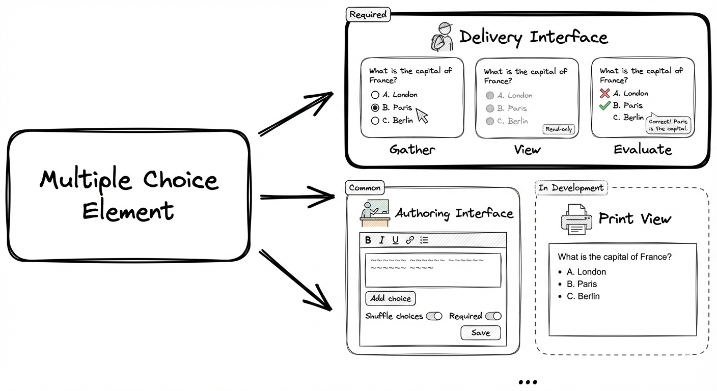
Elements adapt their interface based on environment mode and user role
Live Interactive Example
Try interacting with a live PIE multiple choice element below. Switch between different modes and roles to see how the element adapts:
Loading PIE Player...
Item Configuration Structure
PIE items are configured using JSON with three essential sections that work together:
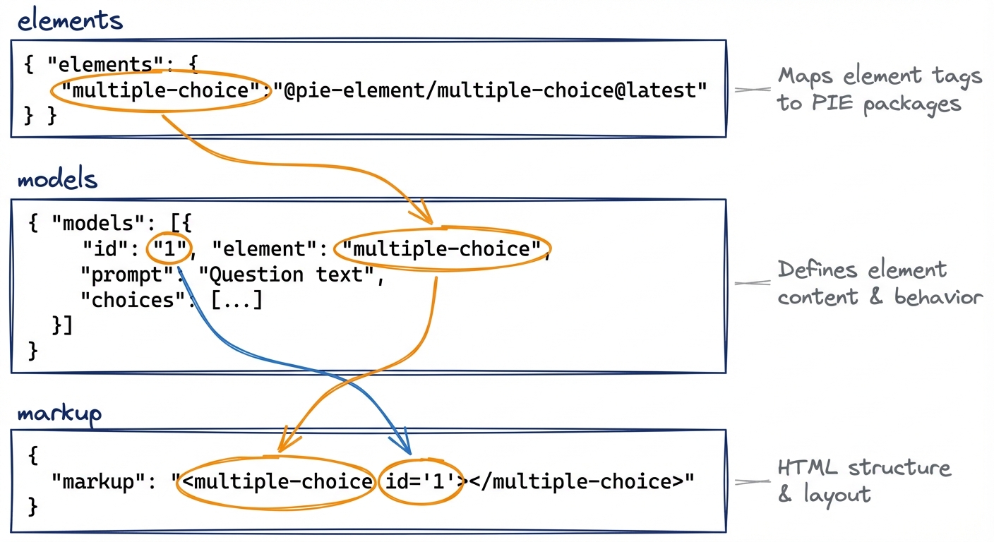
1. elements
Maps element tags from markup to PIE element
NPM packages. Tells the player which PIE elements (and which versions) to load from CDN or your server.
2. models
Array of element configurations. Each model defines one element's content, behavior,
and correct answers. Linked by id.
Each model entry is interpreted by the PIE element implementation it is mapped to. The PIE element
should advertise its interface (the PIE React elements do this through JSON schemas) but ultimately
it is entirely up the PIE element how that is interpreted. In this case, 'choices' is specific for
the multiple-choice PIE element. Only a few things are in all models: the 'id', the 'element'
and the 'prompt'.
3. markup
HTML defining element placement and layout. Can include passages, multiple elements,
and custom structure. Element tags must match elements keys.
While it can be used for sophisticated layout, it is typically not recommended for this and instead
you should try to build in layout concerns in the PIE element implementation and aim for consistency.
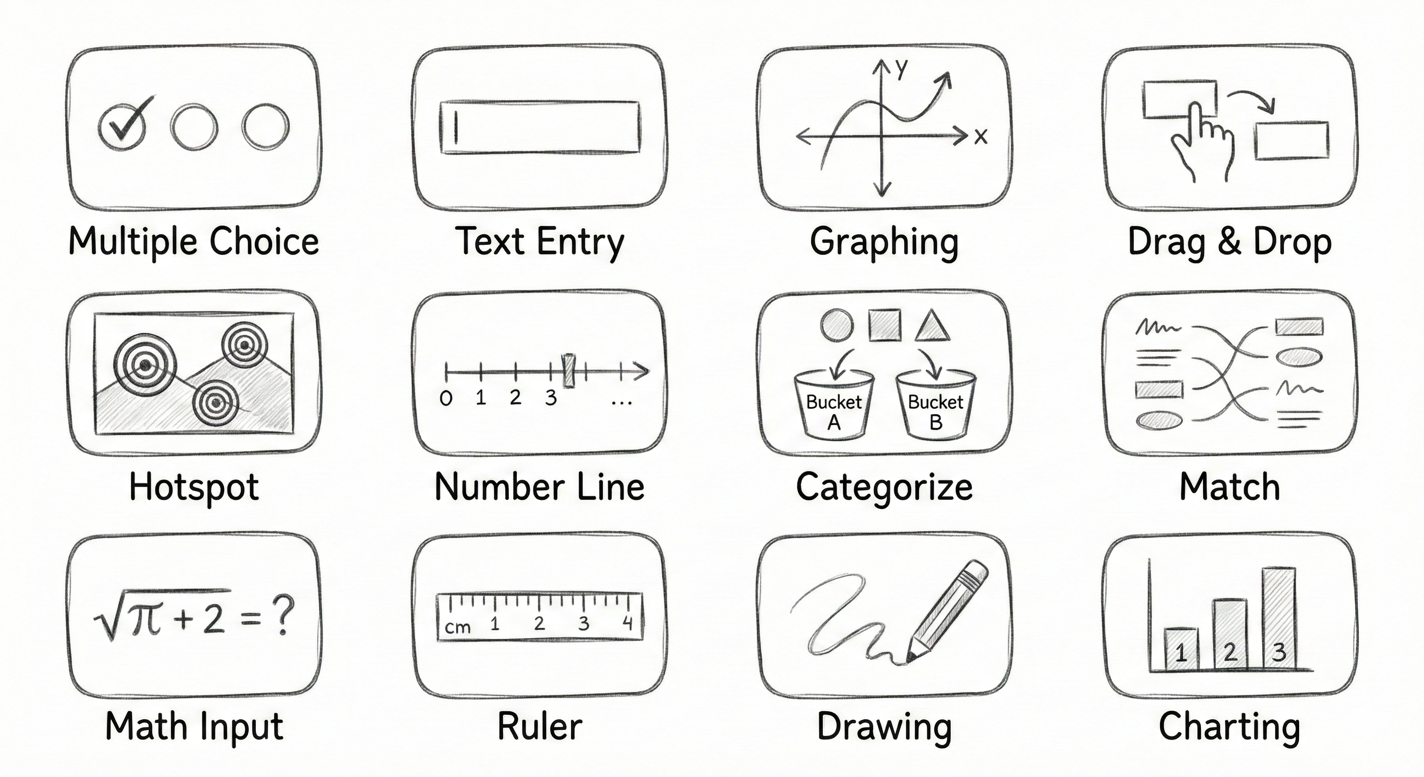
Comprehensive Question Type Library
PIE includes over 20 production-ready question types covering simple to highly complex interactions:
Simple Response
- • Multiple Choice
- • Text Entry
- • Extended Text
- • Inline Choice
- • Math Inline
Matching & Categorization
- • Match
- • Match List
- • Categorize
- • Placement Ordering
- • Drag in the Blank
Visual & Graphical
- • Hotspot
- • Image Cloze Association
- • Drawing Response
- • Graphing
- • Number Line
Support Elements
- • Passage
- • Rubric
- • Image
- • Math Templated
Element Examples
Categorize - Authoring View
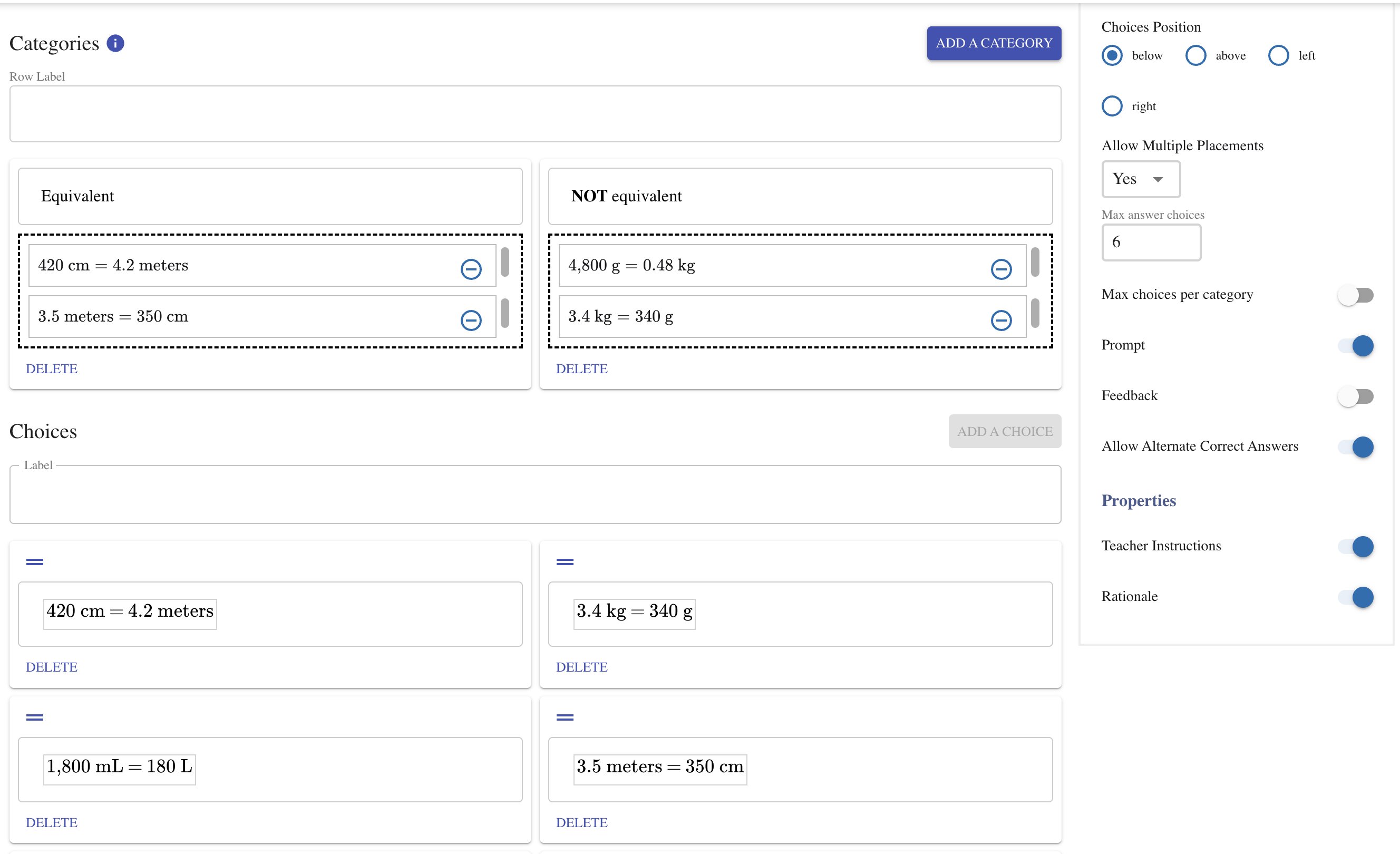
WYSIWYG authoring interface for configuring a drag-and-drop categorization question
Categorize - Student View
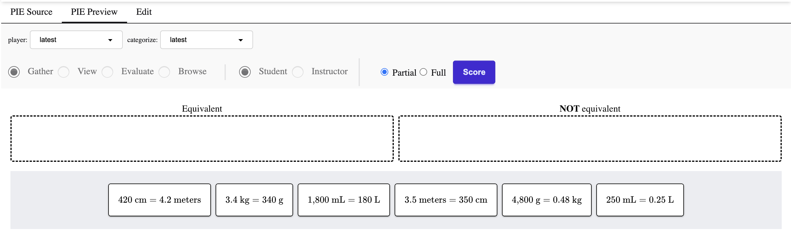
Interactive student experience: drag items into labeled categories
Hotspot - Authoring View
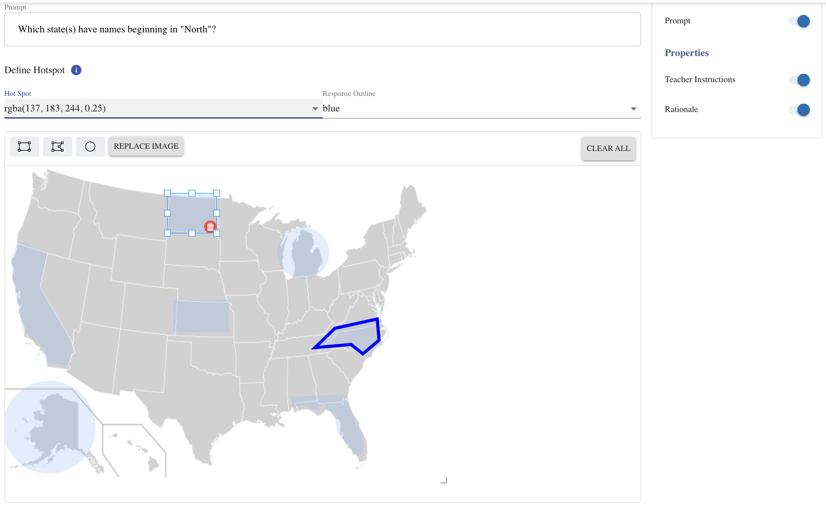
Define clickable regions on images during authoring
Hotspot - Evaluation View
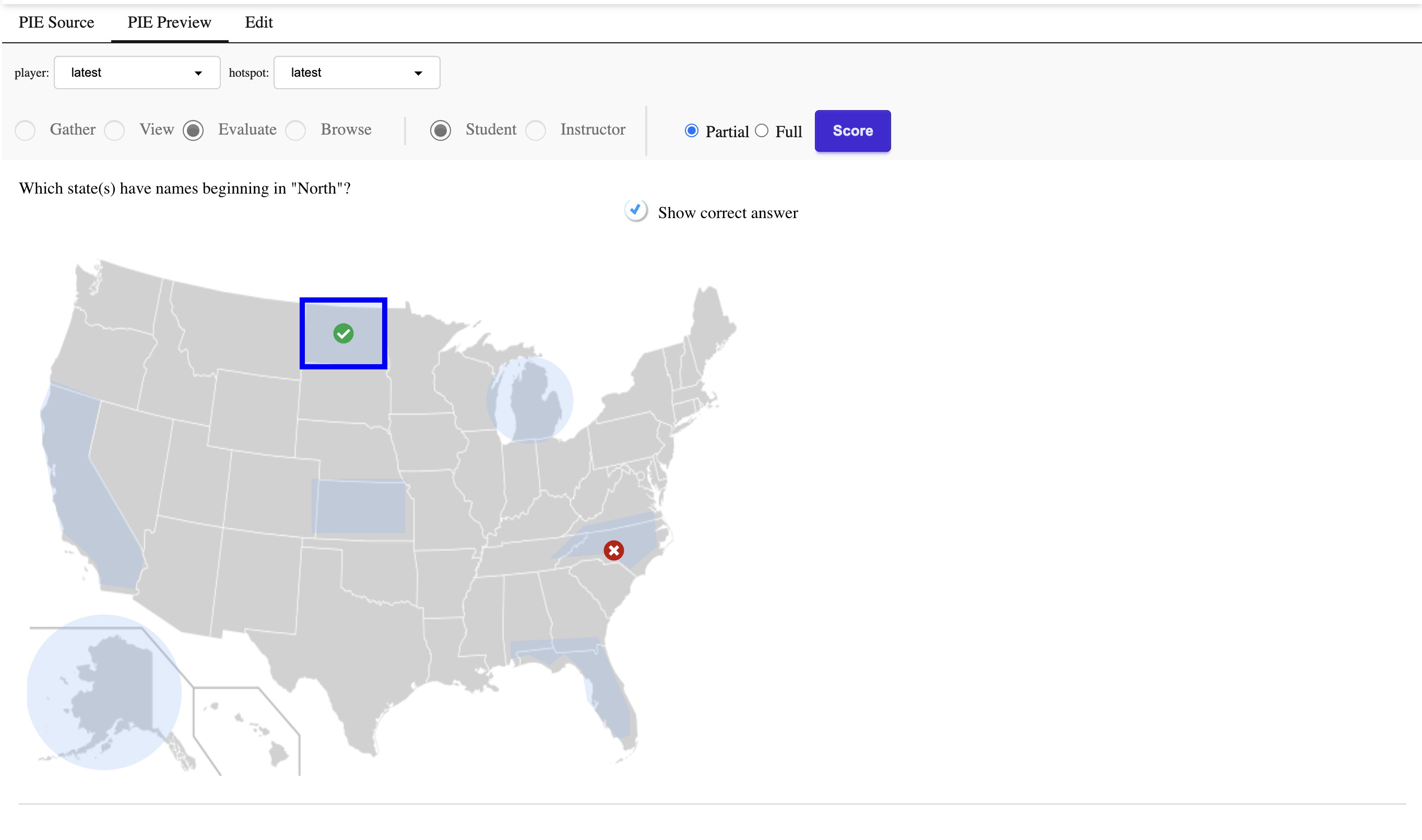
Show correct and incorrect responses with visual feedback
Building Custom Elements
Organizations with specialized assessment needs can build custom elements following PIE's established patterns.
Element Boilerplate
Templates and scaffolding for new question types, following PIE conventions for delivery, authoring, and controllers.
Shared Component Libraries
Reusable UI components for prompts, feedback displays, math rendering, and other common patterns.
Controller Interface
Framework-agnostic JavaScript/TypeScript interface for scoring and validation logic with model() and outcome() functions.
30+ Reference Implementations
Comprehensive examples demonstrating patterns. Custom elements integrate seamlessly, gaining accessibility support, print rendering, and player compatibility.
Accessibility Throughout
Every PIE element includes accessibility features as part of its core implementation — not optional configurations added as an afterthought.
Try More Examples
Want to explore more question types? Check out the PIE Playground with 20+ pre-configured examples you can try and modify.