Assessment Toolkit
Composable services for tools, accommodations, and accessibility — coordinated through a centralized ToolkitCoordinator.
ToolkitCoordinator
The toolkit is designed as a toolkit, not a framework — products use only what they need. Rendering items without tools? Use just the player. Need calculator and ruler? Add those tools. Full accommodation support with TTS, high contrast, and PNP profiles? Integrate the complete toolkit.
When connected to the section player, the toolkit automatically handles:
- SSML extraction from passages and items for text-to-speech
- Accessibility catalog lifecycle (add on load, clear on navigation)
- TTS tools rendered inline in passage and item headers
- Z-index layering coordination for overlapping tools
- Text highlighting synchronized with TTS playback
Tool Placement
Tools are placed at three levels — section, item, and passage — each with its own toolbar scope. The ToolkitCoordinator drives which tools appear where based on a placement configuration.
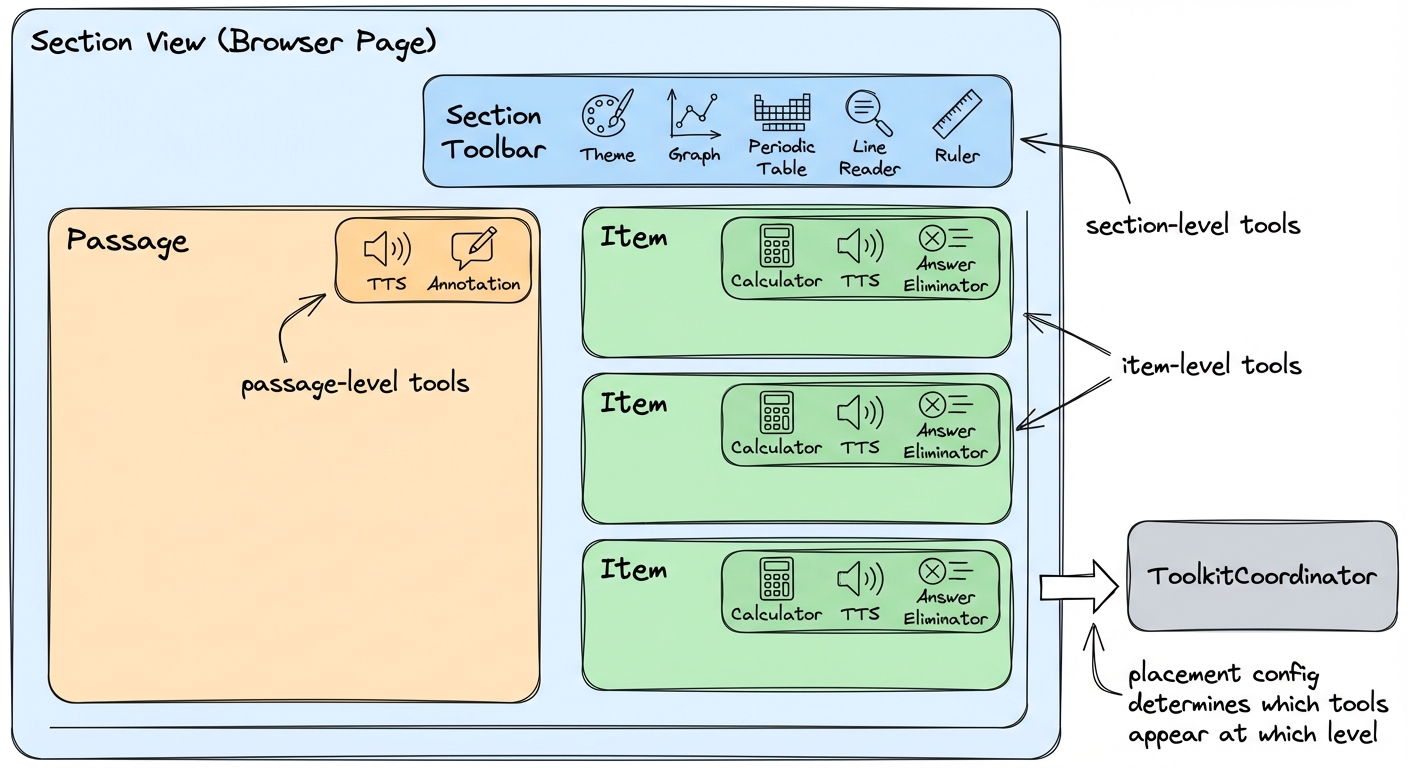
Section Level
Available across all items in the section. Typically reference tools that persist while the student works through the page.
Item Level
A playback button or control in each item header. Tools that operate on a specific question's content.
Passage Level
Tools that let students interact with reading content — highlighting, annotation, and playback.
Tool Categories
Reference Tools
Utilities for calculations and measurements
- • Calculator — Scientific and graphing modes (Desmos integration)
- • Ruler — Metric and imperial with drag, rotation, and snap-to-grid
- • Protractor — Angle measurement with center origin alignment
- • Graph — Interactive coordinate plane
- • Periodic Table — Chemistry reference
Accessibility Tools
Supporting students with diverse needs
- • Line Reader — Masks content to highlight individual lines
- • Color Schemes — High-contrast and accessibility overlays
- • Theme — Student-facing light/dark mode toggle
- • Text-to-Speech — Word-level highlighting synchronized to audio (Web Speech API, AWS Polly, Google TTS)
Student Support
Enhancing comprehension and interaction
- • Annotation Toolbar — Highlight text in multiple colors, create underlines and notes
- • Answer Eliminator — Cross out multiple-choice options to narrow choices
Each tool is a Web Component, usable independently or composed into toolbars. The toolkit treats tools and accommodations uniformly — same placement model, same lifecycle. The policy distinction (which student sees which tools) is the host application's responsibility.
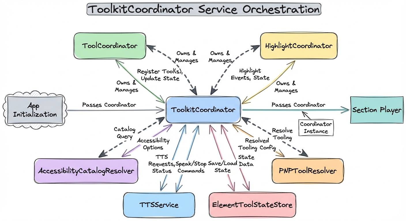
Service Architecture
The ToolkitCoordinator manages five core services that work together, plus additional resolvers and theming infrastructure.
ToolCoordinator
Manages z-index layering and visibility for tools. When multiple tools are open, it ensures proper stacking order with reserved z-index ranges across five layers: content, non-modal tools, modal tools, control handles, and highlight infrastructure.
HighlightCoordinator
Manages simultaneous highlighting using the CSS Custom Highlight API. Students can have persistent annotations in one color while TTS highlights the current word in another. Zero DOM mutation — preserves framework virtual DOM and is screen reader friendly.
TTSService
Text-to-speech with synchronized word-level highlighting. Abstracts TTS providers (browser Web Speech API, AWS Polly, Google TTS) behind a pluggable provider interface, handles playback state, and coordinates with HighlightCoordinator for real-time word tracking.
AccessibilityCatalogResolver
Resolves QTI 3.0-inspired accessibility catalogs with priority ordering: extracted SSML from content, item-level catalogs, and assessment-level catalogs. Supports pre-recorded audio, sign language videos, and braille alternatives.
ElementToolStateStore
Manages per-element ephemeral tool state (annotation colors, calculator position) using globally unique composite keys. Tool state is client-only and not sent to the server for scoring.
PNPToolResolver
Resolves tool availability using QTI 3.0 Personal Needs Profile (PNP) precedence rules: district blocks, test administration overrides, item restrictions, item requirements, district requirements, and PNP supports.
<pie-theme> Element
Provides theming through a provider adapter model. It reads CSS variables from an existing design system (a DaisyUI adapter is built in) and maps them to PIE's --pie-* custom properties. Color schemes are accessibility overlays applied on top of the base theme, and students can select their preferred scheme at runtime via the color scheme toolbar tool.
WCAG 2.2 Compliance
The toolkit's accessibility features target WCAG 2.2 Level AA compliance: