Docs: Players
Players and building blocks
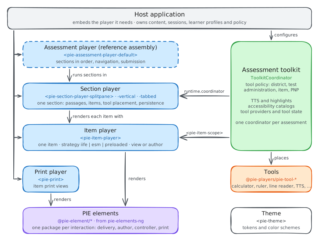
PIE ships an item player, a section player with its assessment toolkit, and a print player. <pie-assessment-player-default> is a reference assembly of the section player
and toolkit; production assessment shells are built by the host from the same packages. A page
that needs tools without section layout wraps item players in <pie-assessment-toolkit> and <pie-item-scope>.
Building blocks
Every player is a custom element that bundles its own runtime, so the host page needs no framework. Hosts compose them into the delivery they need; the integration patterns name the four common assemblies.
Item player
<pie-item-player> renders one item: it loads the item's elements, runs their controllers in the browser or renders server-processed models, and reports session changes.
Section player
Four layout elements render a section's passages and items. Each hosts the assessment
toolkit: tools placed through runtime.tools.placement appear in the section
toolbar and in item and passage headers.
Assessment toolkit
<pie-assessment-toolkit>, <pie-item-scope>, <pie-item-toolbar> and <pie-section-toolbar> coordinate
tools, read-aloud, highlighting, accessibility catalogs and tool policy. Assessment toolkit
Tools
One @pie-players/pie-tool-* package per tool, each a <pie-tool-*> custom element. @pie-players/pie-default-tool-loaders registers the packaged set.
Print player
<pie-print> renders an item for printing, for a student or an instructor.
Theme
<pie-theme> merges a light, dark or auto base theme, a provider adapter, a color
scheme and explicit variables into the tokens players and elements read. Theme README(opens in new tab)
Reference assessment player
<pie-assessment-player-default> assembles section players, navigation
and one assessment session. Production hosts replace it with their own shell.
All @pie-players/* packages release together under one version number; the samples
on this site pin 0.3.75. Every release is a patch release, breaking changes
included, so pin it exactly and read the changelog before upgrading. 1.0 ships first as 1.0.0-beta.N prereleases under the beta npm tag. Versioning(opens in new tab)
<pie-element-player> in pie-elements-ng renders one element in isolation for
element development and demos.
Item player
<pie-item-player> renders one item from its config: the markup, the element
map and one model per element. Install it from npm, or load its browser entry from jsDelivr as
a module script:
https://cdn.jsdelivr.net/npm/@pie-players/pie-item-player@0.3.75/dist/pie-item-player.js
session-changed carries the whole item session; store it, and assign it back to player.session to resume. provideScore() runs each element's scoring
controller in the browser and returns one slot per model, undefined where an element has no outcome. A hosted player scores nothing in the browser.
Loading strategies
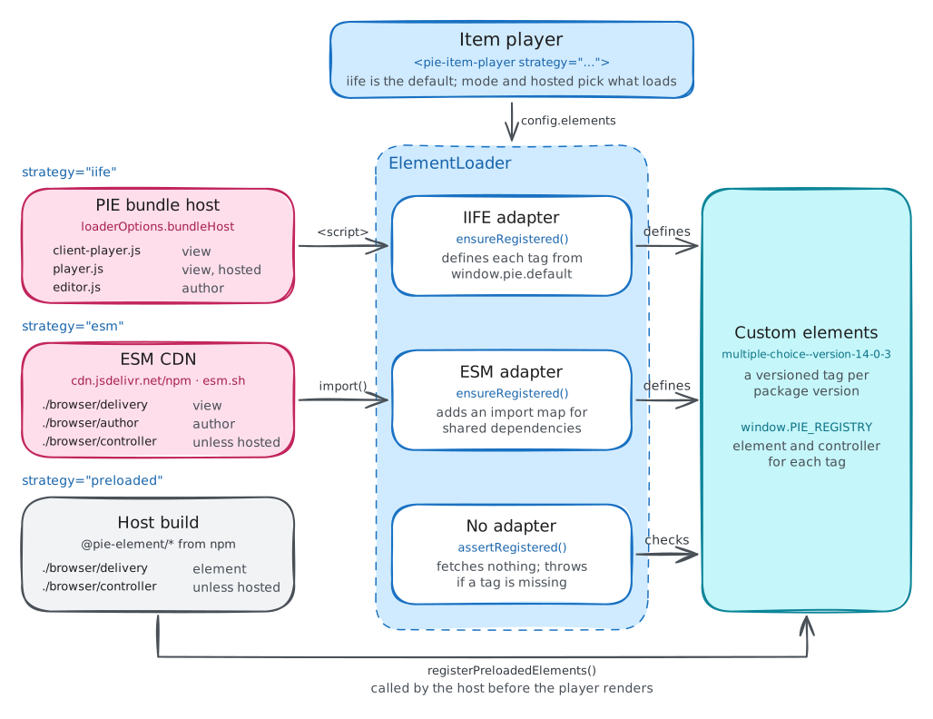
Three strategies decide where element code comes from; rendering is the same once an element is
registered. The strategy attribute selects one.
iife (default) | esm | preloaded | |
|---|---|---|---|
| Element code from | The PIE bundle host, or loaderOptions.bundleHost | ESM CDN: jsDelivr by default, or esm.sh | Element packages the host bundles from npm |
| Loaded by | Script injection | Native import(); the player adds an import map for shared React | The host bundle; the player asserts registration |
| Host setup | None | None; needs a browser with import-map support | registerPreloadedElements(...) before mount; math.assetRoot |
| Best for | Production on PIE bundle infrastructure | ESM-compatible element packages | Section preloading, static builds, offline |
iife
Loads element bundles by script injection from the PIE bundle host; loaderOptions.bundleHost names another host.
esm
Loads element modules with native import() from jsDelivr by default, or
esm.sh, configured through loaderOptions.esmCdnUrl and esmCdnProvider; the browser's module cache shares them across items.
preloaded
The host bundles element packages from npm and registers them with registerPreloadedElements from @pie-players/pie-item-player/preloaded before the player mounts. The player
loads no element code; MathJax assets still load from math.assetRoot. A tag
missing at mount raises a non-recoverable player-error. @pie-players/pie-preloaded-player publishes ready-made element sets for this
strategy.
mode="author" on the same player renders each element's configuration UI and emits model-updated as the author edits. The player sanitizes item markup with DOMPurify; trust-markup turns that off for markup the host trusts. Its events include load-complete, session-changed, player-error and model-updated, plus backend-* events when it talks to a delivery
backend.
Item player overview(opens in new tab) · Loading strategies(opens in new tab) · Item player README(opens in new tab) · Migration from pie-player-components(opens in new tab)
Print player
<pie-print> from @pie-players/pie-print-player renders an item for
printing, with print views for 12 elements; an element without a print build renders a
placeholder. It loads each element's print module from jsDelivr by default. The student role shows no answers or rationales; instructor adds correct
answers and rationales. The player compares config by identity, so each change takes
a new object.
Section player
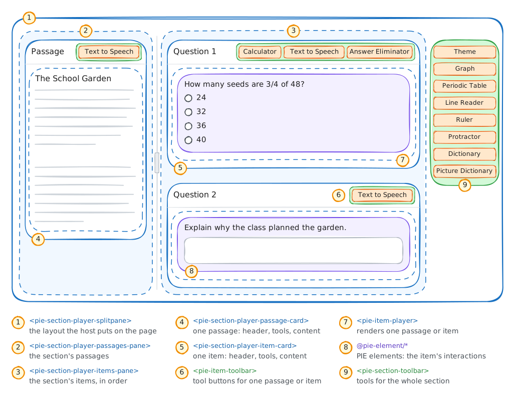
A typical assessment screen pairs a reading passage with the questions about it. A section toolbar offers tools for the whole page: graph, periodic table, line reader, ruler, protractor, dictionaries and color schemes. Each item header carries read-aloud, calculator and answer elimination, the passage header carries read-aloud, and selecting text in either opens the highlighter. All of this needs coordination, shared state, and a coherent lifecycle.
Placement is opt-in. A layout shows no tools until runtime.tools.placement lists
them; SECTION_PLAYER_PREFERRED_TOOL_PLACEMENT from @pie-players/pie-default-tool-loaders is the arrangement above.
Layout structure
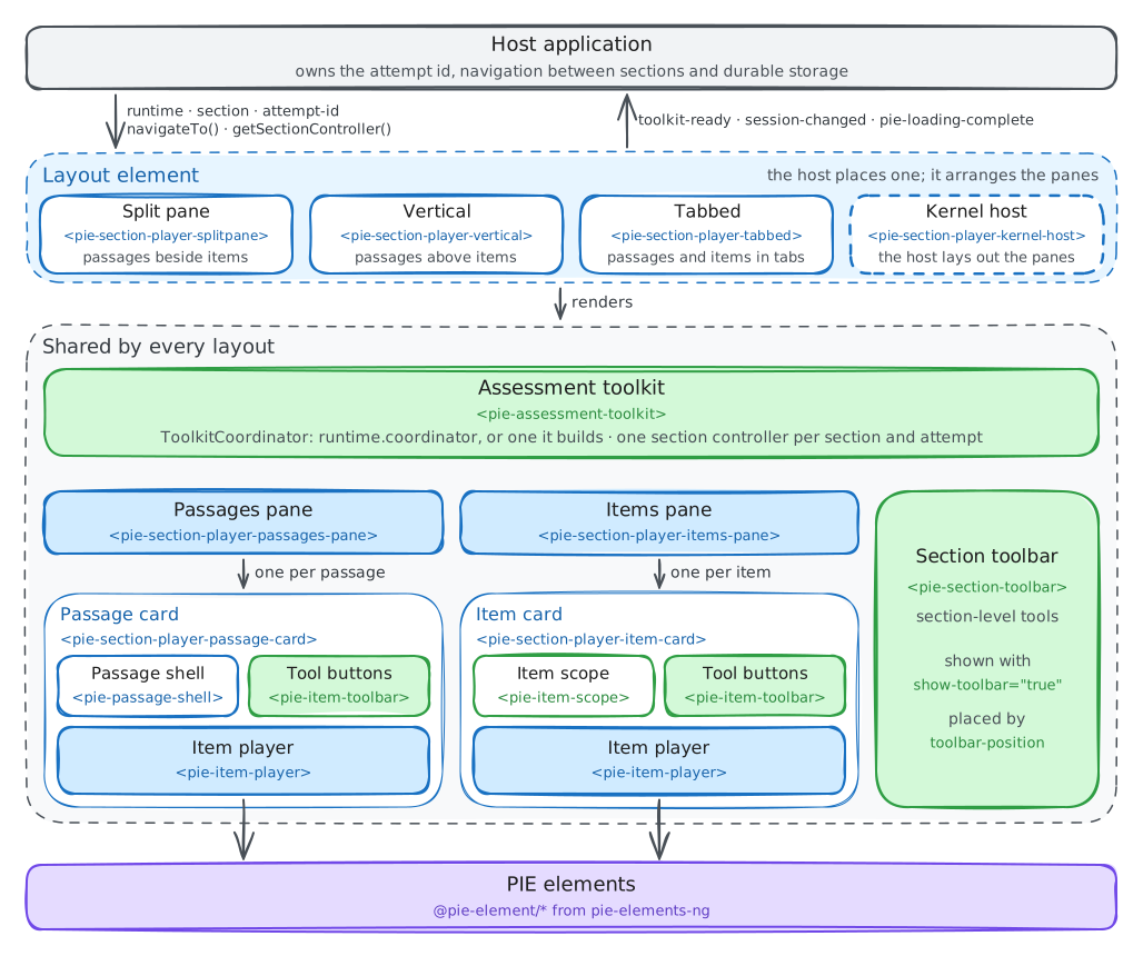
The host places one layout element and sets runtime and section on it.
Each layout renders its own <pie-assessment-toolkit>, which builds a
ToolkitCoordinator or adopts the one in runtime.coordinator; the host reaches it
through toolkit-ready (detail.coordinator). Inside, the passages and
items panes render a card per passage and item, each with its header toolbar and item player,
beside the section toolbar.
<pie-section-player-splitpane>
Passages and items side by side, with a resizable divider. At or below the narrow breakpoint it
collapses to tabs or a vertical stack (split-pane-collapse-strategy).
<pie-section-player-vertical>
The passages above the items, in one column.
<pie-section-player-tabbed>
Passage and items on tabs whenever the section has a passage.
<pie-section-player-kernel-host>
With <pie-section-player-items-pane> and <pie-section-player-passages-pane>, the host composes its own layout
from the stock panes.
The section toolbar renders when show-toolbar is set. toolbar-position takes top, right (the default), bottom, left or none; at viewport widths of 1100 px and narrower the toolbar moves to the top
(narrow-layout-breakpoint).
Integration modes
Either let the layout build a ToolkitCoordinator from runtime.tools, or pass your
own as runtime.coordinator; a coordinator you pass stays yours to configure and
dispose.
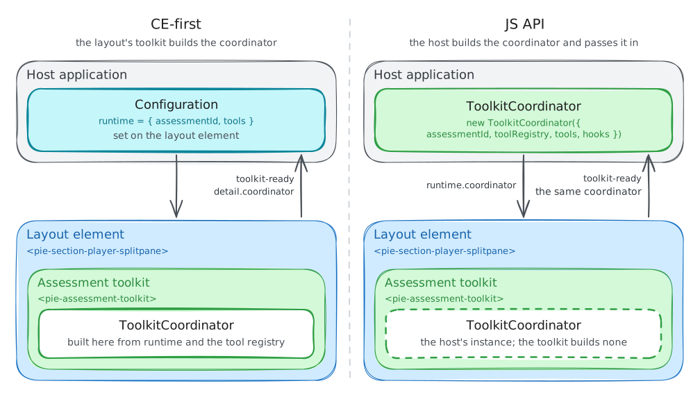
Player-built coordinator
Set section and runtime as JS properties; the layout builds a
ToolkitCoordinator from runtime.tools when runtime.coordinator is absent. section-id, attempt-id, show-toolbar and toolbar-position are attributes.
That coordinator is built without hooks. Changes to runtime after
initialization do not reach it; update it through updateToolConfig and updateToolsPlacement.
Host-built coordinator
The host constructs a ToolkitCoordinator with hooks for session persistence,
tool state and errors, and passes it as runtime.coordinator. The layout builds
none, and toolkit-ready returns the same instance. Coordinator hooks are
available only this way, because they must be in place before the first section controller
exists.
Example
runtime and section are JS properties only. section-id falls back to section.identifier; without attempt-id the default
persistence neither reads nor writes. With a bundler, install @pie-players/pie-section-player; import "@pie-players/pie-section-player" registers the same layouts.
sectionFromItem(itemConfig, { session }) from @pie-players/pie-section-player/item-section wraps one item config as a section, so
a single item gets the toolbars too. For preloaded elements, set runtime.playerType: "preloaded" and register the elements with registerPreloadedElements before the section mounts.
What the toolkit does inside the layout, and which tools exist at which level, is on the Assessment toolkit page. The section controller API and DOM events are on Integration.
Section player integration guide(opens in new tab) · Section player README(opens in new tab)
Reference assessment player
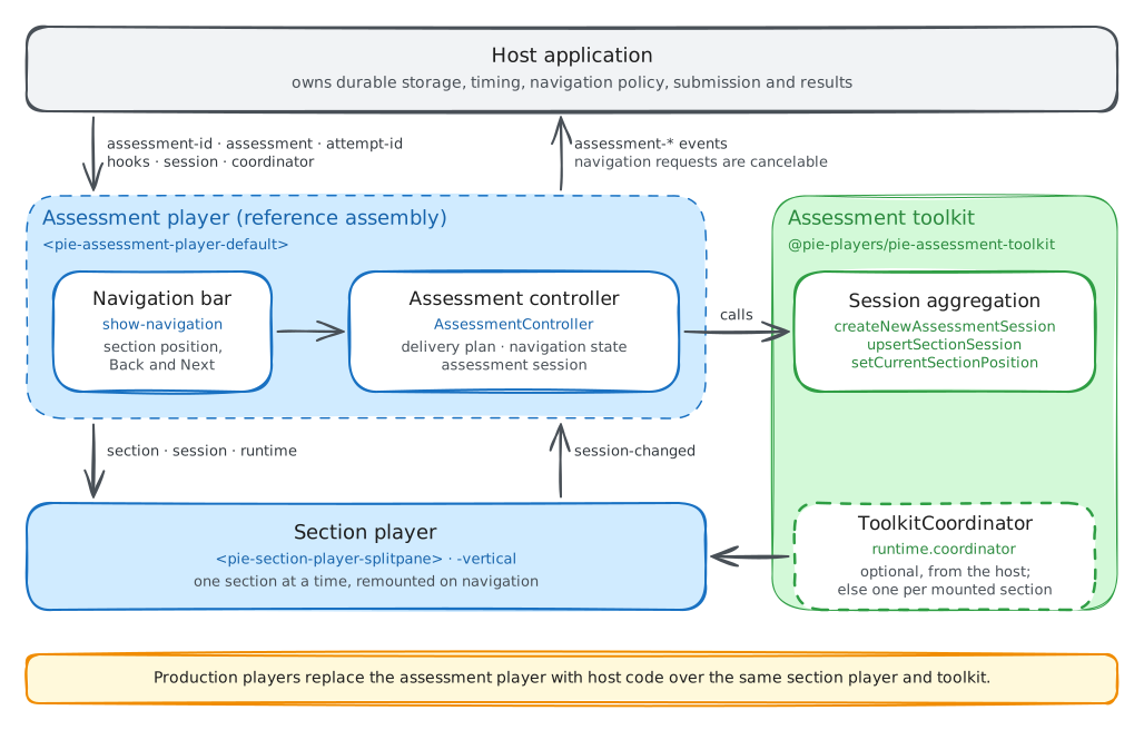
<pie-assessment-player-default> is a reference assembly: it renders navigation
and mounts a section player for the active section, keeping one assessment session across
sections. Production multi-section players are host-built from the same packages, as the custom assessment player pattern describes. The package is for bundlers and changes without a compatibility period.
Content model
An assessment holds sections, optionally grouped into test parts, and each section holds its items. The assessment controller flattens this structure into a linear delivery plan and navigates by position or section id.
Assessment session
One AssessmentSession holds every section's session and the current position.
The controller persists it to localStorage by default; hooks.createAssessmentSessionPersistence supplies the host's own strategy.
assessment-controller-ready carries the AssessmentControllerHandle: navigateTo, navigateNext, navigatePrevious, persist, submit, getSession, subscribe and updateSectionSession. Navigation through the player's own controls and its navigateTo/navigateNext/navigatePrevious methods first
dispatches a cancelable assessment-navigation-requested, and persists after the
move. submit() saves first and rejects, unsubmitted, if that save fails.section-player-layout takes splitpane or vertical.