Docs: Theming
Theming
PIE's players, tools and elements read their colors from --pie-* custom properties. <pie-theme> computes those tokens and writes them onto one element, from which they
inherit into every item, including inside shadow DOM.
The theme element
| Attribute | Values | Default |
|---|---|---|
theme | light, dark or auto | light |
scope | self or document | self |
provider | a provider id, auto or none | auto |
scheme | a color-scheme id | default (none) |
variables | JSON of custom-property overrides | none |
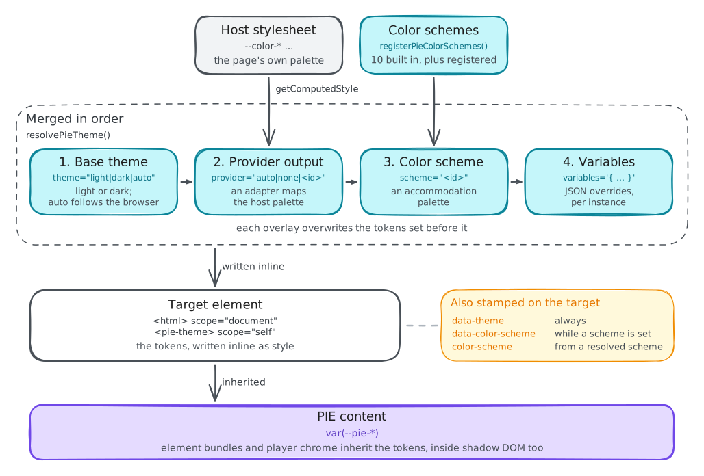
A mounted <pie-theme> writes its tokens inline, and an inline declaration beats any
stylesheet rule, so a host stylesheet that sets --pie-* cannot override it. Change tokens
through variables or a registered scheme. Without the element, the stylesheet-only
path (tokens.css, color-schemes.css, font-sizes.css) follows the
normal cascade.
Resolution order
Four layers, each overwriting the tokens the one before set: the base theme, the provider adapter's
output, the resolved color scheme, and explicit variables.
Provider adapters
provider decides whether PIE content takes the host's look or PIE's own. none keeps the canonical palette, identical in every host. The built-in DaisyUI
adapter maps DaisyUI's slots onto PIE tokens and raises text pairs to 4.5:1 contrast as it maps. registerPieThemeProvider adds an adapter for another design system.
Token registry
@pie-players/pie-theme/token-registry.json lists every public token with its owner,
category and whether color schemes must set it. Registered names and values are part of the
public surface. Token registry(opens in new tab)
Color schemes
A theme is presentation; a color scheme is an accommodation under WCAG 1.4.1, 1.4.3 and 1.4.11. A scheme replaces every color it covers, folds fixed hues such as chart categories into its two colors, and recolors authored inline colors in item content so dark ink never lands on a dark page. Ten ship built in:
A program with its own palettes registers them as partial overlays. Each entry is validated against the token registry, and an invalid one is rejected without dropping its siblings. Contrast problems come back as warnings on the returned receipt, because the palette is yours: read them.
Learners choose a scheme with the theme tool(opens in new tab), a
section-level toolkit tool that sets scheme on the nearest <pie-theme> and keeps the choice per attempt through the toolkit's tool-state hooks.
Host chrome
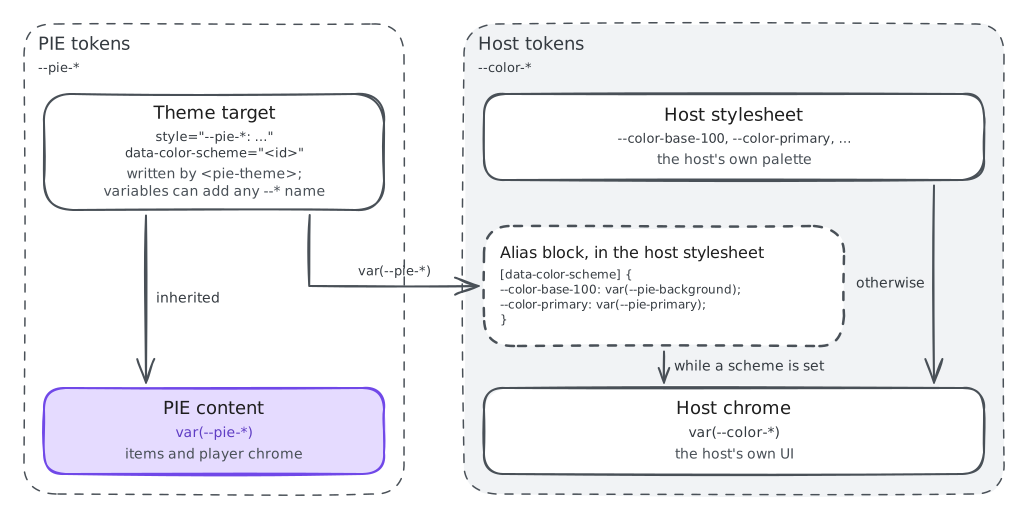
<pie-theme> writes --pie-* tokens only, so switching a theme recolors PIE
content and leaves your page's own UI alone. To carry an active accommodation into your chrome,
alias your tokens to PIE's under [data-color-scheme], which is set only while a scheme
is active.
theme="dark" does not darken native controls such as select and scrollbars;
that stays your page's own color-scheme declaration. A resolved color scheme sets it for
you.
Font size
Set data-font-size on any ancestor of a player, or --pie-font-scale through variables. The presets match Learnosity's steps, which accommodation profiles are
already written against.
| Preset | Scale |
|---|---|
normal | 1 |
large | 1.25 |
xlarge | 1.5 |
xxlarge | 1.75 |
Reference
How theming works(opens in new tab) · Theme README(opens in new tab) · Theming WCAG matrix(opens in new tab) · Accessibility