Choice and text
Multiple Choice
Choose one or more answers from a list.
Delivery
Respond, review and evaluate
Authoring
Visual editor available
Print view available
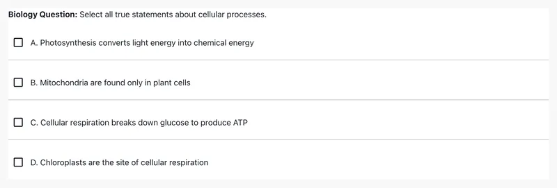
Try the interaction
Live example: @pie-element/multiple-choice@14.0.4 · players 1.0.0-beta.5.
Open all examples for this element →Use it in an item
Map the tag to an exact package version and match the model ID to the markup. The item player loads the views. You can use any frontend framework.
{
  "elements": {
    "multiple-choice": "@pie-element/multiple-choice@14.0.4"
  },
  "markup": "<multiple-choice id=\"example\"></multiple-choice>",
  "models": [
    {
      "id": "example",
      "element": "multiple-choice",
      "choiceMode": "checkbox",
      "choicePrefix": "letters",
      "choices": [
        {
          "correct": true,
          "value": "photosynthesis",
          "label": "Photosynthesis converts light energy into chemical energy",
          "feedback": {
            "type": "default",
            "value": "Correct! Photosynthesis is the process by which plants convert sunlight into glucose."
          },
          "rationale": "Photosynthesis is performed by plants, algae, and some bacteria. It uses light energy to convert carbon dioxide and water into glucose and oxygen."
        },
        {
          "correct": false,
          "value": "mitochondria",
          "label": "Mitochondria are found only in plant cells",
          "feedback": {
            "type": "default",
            "value": "Incorrect. Mitochondria are found in both plant and animal cells."
          },
          "rationale": "Mitochondria are the \"powerhouses\" of the cell and are present in nearly all eukaryotic cells, including both plants and animals."
        },
        {
          "correct": true,
          "value": "cellular-respiration",
          "label": "Cellular respiration breaks down glucose to produce ATP",
          "feedback": {
            "type": "default",
            "value": "Correct! Cellular respiration is how cells extract energy from glucose."
          },
          "rationale": "Cellular respiration occurs in the mitochondria and converts glucose and oxygen into ATP (energy), carbon dioxide, and water. This is essentially the reverse of photosynthesis."
        },
        {
          "correct": false,
          "value": "chloroplasts",
          "label": "Chloroplasts are the site of cellular respiration",
          "feedback": {
            "type": "default",
            "value": "Incorrect. Chloroplasts are where photosynthesis occurs, not cellular respiration."
          },
          "rationale": "Chloroplasts contain chlorophyll and are responsible for photosynthesis in plant cells. Cellular respiration takes place in the mitochondria."
        }
      ],
      "extraCSSRules": {
        "names": [
          "red",
          "blue"
        ],
        "rules": "\n      .red {\n        color: red !important;\n      }\n\n      .blue {\n        color: blue !important;\n      }\n    "
      },
      "prompt": "<p><strong>Biology Question:</strong> Select all true statements about cellular processes.</p>",
      "promptEnabled": true,
      "toolbarEditorPosition": "bottom",
      "rubricEnabled": false
    }
  ]
} Responses and scoring
The controller defines scoring for this element. Browser scoring returns one outcome per element. Your application combines those outcomes into an item score and handles trusted server scoring.
Model, configuration and session reference
The model holds content, configuration controls the editor, and the session holds the response. Fields below come from generated JSON Schemas.
Schema version: @pie-element/multiple-choice@14.0.6. Example version: 14.0.4. Use the schema matching your content. Schema checks cover data structure; controller validation checks authoring rules.
model fields (44)
| Field | Type | Meaning | Default / values |
|---|---|---|---|
idRequired | string | Identifier to identify the Pie Element in html markup, Must be unique within a pie item config. | — |
elementRequired | string | The html Element tag name: the key in the item config's `elements` map, e.g. "multiple-choice" | — |
accessibilityCatalogs | array | QTI-aligned accessibility catalogs whose cards dock to content nodes by `data-catalog-idref` | — |
choiceMode | string | Indicates the choices are single or multiple selection | —["checkbox","radio"] |
choicePrefix | string | What key should be displayed before choices: `none` displays no key. | "letters"["letters","numbers","none"] |
choicesRequired | array | The choice options for the question | — |
prompt | string | The question prompt or item stem | — |
promptEnabled | boolean | Determines if prompt should show | — |
choicesLayout | string | Indicates the layout of choices for player | "vertical"["grid","horizontal","vertical"] |
gridColumns | number | Indicates the number of columns for the grid layout | 2 |
toolbarEditorPosition | string | Indicates the editor's toolbar position which can be 'bottom' or 'top' | "bottom"["bottom","top"] |
selectedAnswerBackgroundColor | string | Indicates the background color for selected choices | "initial" |
selectedAnswerStrokeColor | string | Indicates the border color for selected choices | "initial" |
selectedAnswerStrokeWidth | string | Indicates the border width for selected choices if selectedAnswerBackgroundColor is set | "initial" |
hoverAnswerBackgroundColor | string | Indicates the background color for choices on hover | "initial" |
hoverAnswerStrokeColor | string | Indicates the border color for choices on hover | "initial" |
hoverAnswerStrokeWidth | string | Indicates the border width for choices on hover if hoverAnswerBackgroundColor is set | "initial" |
lockChoiceOrder | boolean | Indicates the order of choices presented to user if true, answer choices will be presented in the order they are defined in the model If false, answer choices may be presented in a random order (depending upon the value of the lockChoiceOrder environment variable) | — |
minSelections | number | Indicates that minimum selections that should be made (only for choice mode 'checkbox') | — |
maxSelections | number | Indicates that maximum selections that should be made (only for choice mode 'checkbox') | — |
partialScoring | boolean | Indicates that the item should use partial scoring | — |
scoringType | string | Indicates scoring type | —["auto","rubric"] |
studentInstructions | string | Indicates student instructions | — |
teacherInstructions | string | Indicates teacher instructions | — |
feedbackEnabled | boolean | Indicates if feedback is enabled | — |
defaultFeedback | object | Messages for choices whose feedback type is `default` | — |
rationaleEnabled | boolean | Indicates if Rationale are enabled | — |
rationale | string | Not read by the element: each choice carries its own `rationale`. Default models include it. | — |
spellCheckEnabled | boolean | Indicates if spellcheck is enabled for the author. Default value is true | — |
studentInstructionsEnabled | boolean | Indicates if Student Instructions are enabled | — |
teacherInstructionsEnabled | boolean | Indicates if Teacher Instructions are enabled | — |
accessibilityLabelsEnabled | boolean | Indicates if Accessibility Labels are enabled | — |
rubricEnabled | boolean | Indicates if Rubric is enabled | — |
language | string | Indicates the language of the component Supported options: en, es, en_US, en-US, es_ES, es-ES, es_MX, es-MX | — |
isSelectionButtonBelow | boolean | Indicates if the selection button and choice prefix should be positioned below the corresponding answer choice | — |
fontSizeFactor | number | Indicates font size adjustment factor | — |
autoplayAudioEnabled | boolean | Indicates if the audio for the prompt should autoplay | — |
autoplayAudioHeld | boolean | Set by the player when the host holds autoplay; it outranks `autoplayAudioEnabled` | — |
completeAudioEnabled | boolean | Indicates if the audio should reach the end before the item can be marked as 'complete' | — |
customAudioButton | CustomAudioButton | Indicates if the audio should be replaced with a custom audio button | — |
keyboardEventsEnabled | boolean | Lets learners select a choice in gather mode by pressing its number or letter key | — |
extraCSSRules | ExtraCSSRules | Host-supplied CSS scoped to the element | — |
verticalMode | boolean | Deprecated: Use `choicesLayout`; `false` reads as `horizontal`. | — |
limitChoicesNumber | boolean | Deprecated: Caps the author at 9 choices; use the configuration's `maxAnswerChoices`. | — |
Named object types
AccessibilityCatalog
| Field | Type | Meaning | Default / values |
|---|---|---|---|
identifierRequired | string | See the named type or the example model. | — |
cardsRequired | array | See the named type or the example model. | — |
CatalogCard
| Field | Type | Meaning | Default / values |
|---|---|---|---|
catalogRequired | string | See the named type or the example model. | — |
language | string | See the named type or the example model. | — |
content | string | See the named type or the example model. | — |
payload | CatalogCardPayload | See the named type or the example model. | — |
SignLanguageCardPayload
| Field | Type | Meaning | Default / values |
|---|---|---|---|
signLang | string | Language tag for the signed translation — BCP 47, which admits ISO 639-3 subtags for languages with no 639-1/2 code. "ase" is ASL, matching QTI 3 `xml:lang`. This is the language of the *adaptation*, not the item's base content language (AfA/PNP's `languageOfAdaptation`). The distinction is load bearing: a Spanish item's signed alternate is LSM, not ASL, so `signLang` must never be inferred from the item or assessment content language. Optional, and redundant on almost every card. The card's `language` states the same code and is the only field pie-players resolves a card on — resolution runs before anything knows the card is a signing card, so it can only key on the generic field — and the player falls back to it when this is absent. Author it only where the two differ: a card tagged with the item's content language (`language: 'en-US'`, `signLang: 'ase'`) so resolution reaches it by the default-language rung. The pie-api-aws importer emits `language` alone. | — |
mediaRequired | MediaAssetRef | See the named type or the example model. | — |
fragment | MediaFragmentRange | See the named type or the example model. | — |
MediaAssetRef
| Field | Type | Meaning | Default / values |
|---|---|---|---|
versionRequired | number | See the named type or the example model. | — |
idRequired | string | See the named type or the example model. | — |
kindRequired | MediaKind | See the named type or the example model. | — |
sourcesRequired | array | See the named type or the example model. | — |
poster | string | See the named type or the example model. | — |
thumbnail | string | See the named type or the example model. | — |
durationSeconds | number | See the named type or the example model. | — |
tracks | array | See the named type or the example model. | — |
transcript | TranscriptRef | See the named type or the example model. | — |
label | string | See the named type or the example model. | — |
description | string | See the named type or the example model. | — |
lang | string | Language of the asset itself, as authored metadata. Sign-language cards leave it unset: the card's `language` already states the adaptation language, and a second copy is a second thing to keep in agreement. | — |
MediaSource
| Field | Type | Meaning | Default / values |
|---|---|---|---|
srcRequired | string | See the named type or the example model. | — |
type | string | MIME type, e.g. "video/mp4". | — |
width | number | See the named type or the example model. | — |
height | number | See the named type or the example model. | — |
bitrate | number | See the named type or the example model. | — |
TextTrackRef
| Field | Type | Meaning | Default / values |
|---|---|---|---|
srcRequired | string | See the named type or the example model. | — |
kindRequired | string | See the named type or the example model. | —["captions","subtitles","descriptions","chapters","metadata"] |
langRequired | string | See the named type or the example model. | — |
labelRequired | string | See the named type or the example model. | — |
default | boolean | See the named type or the example model. | — |
TranscriptRef
| Field | Type | Meaning | Default / values |
|---|---|---|---|
src | string | See the named type or the example model. | — |
html | string | See the named type or the example model. | — |
plainText | string | See the named type or the example model. | — |
lang | string | See the named type or the example model. | — |
MediaFragmentRange
| Field | Type | Meaning | Default / values |
|---|---|---|---|
startSecondsRequired | number | See the named type or the example model. | — |
endSeconds | number | See the named type or the example model. | — |
SpokenAudioCardPayload
| Field | Type | Meaning | Default / values |
|---|---|---|---|
mediaRequired | MediaAssetRef | See the named type or the example model. | — |
fragment | MediaFragmentRange | See the named type or the example model. | — |
Choice
| Field | Type | Meaning | Default / values |
|---|---|---|---|
correct | boolean | Indicates if the choice is correct | — |
valueRequired | string | the value that will be stored if this choice is selected | — |
labelRequired | string | the text label that will be presented to the user for this choice | — |
feedback | Feedback | Feedback shown for this choice in evaluate mode, when `feedbackEnabled` is set | — |
rationale | string | Rationale for the Choice | — |
Feedback
| Field | Type | Meaning | Default / values |
|---|---|---|---|
typeRequired | string | See the named type or the example model. | "default"["custom","default","none"] |
value | string | Value for feedback | — |
custom | string | Custom value for feedback | — |
CustomAudioButton
| Field | Type | Meaning | Default / values |
|---|---|---|---|
playImageRequired | string | image url for the play state | — |
pauseImageRequired | string | image url for the pause state | — |
ExtraCSSRules
| Field | Type | Meaning | Default / values |
|---|---|---|---|
names | array | See the named type or the example model. | — |
rules | string | See the named type or the example model. | — |
configuration fields (34)
| Field | Type | Meaning | Default / values |
|---|---|---|---|
answerChoiceCount | number | The number of empty choices to show in config view if no choice model is provided | 0 |
addChoiceButton | ConfigureProp | Configuration for the button that adds a choice | — |
baseInputConfiguration | EditableHtmlConfigureProp | Toolbar plugins every editable field starts from; a field's own `inputConfiguration` overrides it | — |
choices | EditableHtmlPluginConfigure | Configuration for the choice editors | — |
choiceMode | ConfigureProp | Settings Panel control for the choice mode (radio / checkboxes) | — |
choicePrefix | ConfigureProp | Settings Panel control for the choice prefix | — |
deleteChoice | ConfigureProp | Whether the author can delete choices | — |
feedback | ConfigureProp | Settings Panel control for feedback | — |
prompt | EditableHtmlPluginConfigureRequired | Configuration for the prompt | — |
spellCheck | ConfigurePropWithEnabled | Settings Panel control for spellcheck; `enabled` is the default for new items | — |
choicesLayout | ConfigureProp | Settings Panel control for the choices layout | — |
gridColumns | ConfigureProp | Settings Panel control for the number of grid columns | — |
lockChoiceOrder | ConfigureProp | Settings Panel control for locking the choice order | — |
partialScoring | ConfigureProp | Settings Panel control for partial scoring | — |
rationale | EditableHtmlPluginConfigureRequired | Configuration for the choice rationales | — |
scoringType | ConfigureProp | Settings Panel control for the scoring type | — |
settingsPanelDisabled | boolean | Indicates if the settings panel is not available | — |
studentInstructions | ConfigureProp | Settings Panel control for student instructions | — |
teacherInstructions | EditableHtmlPluginConfigureRequired | Configuration for the teacher instructions | — |
toolbarEditorPosition | ConfigureProp | Not read by the authoring surface; the model's `toolbarEditorPosition` sets the position | — |
sequentialChoiceLabels | ConfigurePropWithEnabled | Settings Panel control that toggles sequential choice labels | — |
accessibility | EditableHtmlPluginConfigure | Not read by this element | — |
minAnswerChoices | number | Minimum number of answer choices | — |
maxAnswerChoices | number | Maximum number of answer choices | — |
maxImageWidth | MaxImageDimensions | Maximum image width per field | — |
maxImageHeight | MaxImageDimensions | Maximum image height per field | — |
withRubric | ConfigureProp | Settings Panel control for the rubric | — |
mathMlOptions | ConfigureMathMLProp | MathML output and editing | — |
language | ConfigurePropWithEnabled | Settings Panel control for the language; `enabled` shows the language choices | — |
languageChoices | ConfigureLanguageOptions | Language choices configuration Only available if language is enabled | — |
showPrompt | boolean | Not read by this element: the model's `promptEnabled` shows the prompt | — |
promptLabel | string | Not read by this element: `prompt.label` labels the prompt | — |
contentDimensions | ContentDimensions | Dimensions of the authoring container | — |
settingsPartialScoring | boolean | Not read by this element: `partialScoring.settings` shows the partial scoring control | — |
Named object types
ConfigureProp
| Field | Type | Meaning | Default / values |
|---|---|---|---|
settings | boolean | Indicates if the item has to be displayed in the Settings Panel | — |
label | string | Indicates the label for the item that has to be displayed in the Settings Panel | — |
EditableHtmlConfigureProp
| Field | Type | Meaning | Default / values |
|---|---|---|---|
math | EditableHtmlButtonConfigure | See the named type or the example model. | — |
audio | EditableHtmlButtonConfigure | See the named type or the example model. | — |
video | EditableHtmlButtonConfigure | See the named type or the example model. | — |
image | EditableHtmlButtonConfigure | See the named type or the example model. | — |
customPlugins | array | An array of objects that determine custom plugins. A custom plugin is an object which determines how the button will look like (icon) and the event name that will be triggered when the button gets pressed (event). | — |
blockquote | EditableHtmlButtonConfigure | See the named type or the example model. | — |
h3 | EditableHtmlButtonConfigure | See the named type or the example model. | — |
characters | EditableHtmlButtonConfigure | See the named type or the example model. | — |
bold | EditableHtmlButtonConfigure | See the named type or the example model. | — |
html | EditableHtmlButtonConfigure | See the named type or the example model. | — |
italic | EditableHtmlButtonConfigure | See the named type or the example model. | — |
ol_list | EditableHtmlButtonConfigure | See the named type or the example model. | — |
redo | EditableHtmlButtonConfigure | See the named type or the example model. | — |
strikethrough | EditableHtmlButtonConfigure | See the named type or the example model. | — |
sub | EditableHtmlButtonConfigure | See the named type or the example model. | — |
sup | EditableHtmlButtonConfigure | See the named type or the example model. | — |
table | EditableHtmlButtonConfigure | See the named type or the example model. | — |
ul_list | EditableHtmlButtonConfigure | See the named type or the example model. | — |
underline | EditableHtmlButtonConfigure | See the named type or the example model. | — |
undo | EditableHtmlButtonConfigure | See the named type or the example model. | — |
textAlign | EditableHtmlButtonConfigure | See the named type or the example model. | — |
showParagraphs | EditableHtmlButtonConfigure | See the named type or the example model. | — |
separateParagraphs | EditableHtmlButtonConfigure | See the named type or the example model. | — |
pasteFormatting | EditableHtmlButtonConfigure | See the named type or the example model. | — |
superscript | EditableHtmlButtonConfigure | See the named type or the example model. | — |
subscript | EditableHtmlButtonConfigure | See the named type or the example model. | — |
languageCharacters | EditableHtmlButtonConfigure | See the named type or the example model. | — |
responseArea | EditableHtmlButtonConfigure | See the named type or the example model. | — |
EditableHtmlButtonConfigure
| Field | Type | Meaning | Default / values |
|---|---|---|---|
disabled | boolean | Indicates if the plugin is disabled or not | — |
CustomPlugin
| Field | Type | Meaning | Default / values |
|---|---|---|---|
eventRequired | string | The name of the custom event. It needs to be valid (only letters, numbers and "_" can be used). The event is emitted with the "PIE-" prefix. | — |
iconAltRequired | string | The alt for the custom button icon | — |
iconTypeRequired | string | The icon type. Currently, only "SVG" is supported. | — |
iconRequired | string | The icon string. Currently, only SVG is supported, so it needs to be a valid svg. | — |
EditableHtmlPluginConfigure
| Field | Type | Meaning | Default / values |
|---|---|---|---|
settings | boolean | Indicates if the item has to be displayed in the Settings Panel | — |
label | string | Indicates the label for the item that has to be displayed in the Settings Panel | — |
inputConfiguration | EditableHtmlConfigureProp | Configuration for editable-html | — |
EditableHtmlPluginConfigureRequired
| Field | Type | Meaning | Default / values |
|---|---|---|---|
settings | boolean | Indicates if the item has to be displayed in the Settings Panel | — |
label | string | Indicates the label for the item that has to be displayed in the Settings Panel | — |
inputConfiguration | EditableHtmlConfigureProp | Configuration for editable-html | — |
required | boolean | Indicates if the item is required and the value cannot be empty | — |
ConfigurePropWithEnabled
| Field | Type | Meaning | Default / values |
|---|---|---|---|
settings | boolean | Indicates if the item has to be displayed in the Settings Panel | — |
label | string | Indicates the label for the item that has to be displayed in the Settings Panel | — |
enabled | boolean | Indicates the value of the item if it affects config-ui (eg.: if item is a switch and displaying an input on the config-ui depends on the switch value: on/off) | — |
MaxImageDimensions
| Field | Type | Meaning | Default / values |
|---|---|---|---|
teacherInstructions | number | Indicates the max dimension for images in teacher instructions | — |
prompt | number | Indicates the max dimension for images in prompt - this is also the default dimension for all other input fields if it's not specified | — |
rationale | number | Indicates the max dimension for images in rationale | — |
choices | number | Indicates the max dimension for images in choices | — |
ConfigureMathMLProp
| Field | Type | Meaning | Default / values |
|---|---|---|---|
mmlOutput | boolean | Indicates if model should have mathML output instead of latex | — |
mmlEditing | boolean | Indicates if mathML that's already in model should be editable | — |
ConfigureLanguageOptions
| Field | Type | Meaning | Default / values |
|---|---|---|---|
labelRequired | string | See the named type or the example model. | — |
optionsRequired | array | See the named type or the example model. | — |
ConfigureLanguageOptionsProp
| Field | Type | Meaning | Default / values |
|---|---|---|---|
valueRequired | string | Value of the language option | — |
labelRequired | string | Label of the language option | — |
ContentDimensions
| Field | Type | Meaning | Default / values |
|---|---|---|---|
maxHeight | string | number | See the named type or the example model. | — |
maxWidth | string | number | See the named type or the example model. | — |
minHeight | string | number | See the named type or the example model. | — |
minWidth | string | number | See the named type or the example model. | — |
session fields (4)
| Field | Type | Meaning | Default / values |
|---|---|---|---|
id | string | Identifier of the session | — |
element | string | The element the session belongs to | — |
value | array | Values of the selected choices | — |
shuffledValues | array | Choice values in the order they were shuffled for this learner, when choice order is not locked | — |
Accessibility and content requirements
PIE targets WCAG 2.2 AA. Provide clear prompts and media alternatives, and test the question with a keyboard and assistive technology. Manual testing is still incomplete; see the coverage notes below.
Accessibility and evidence · Element evidence and manual checks(opens in new tab)
Element package source(opens in new tab) · Example source(opens in new tab) · Snapshot cb30a68f